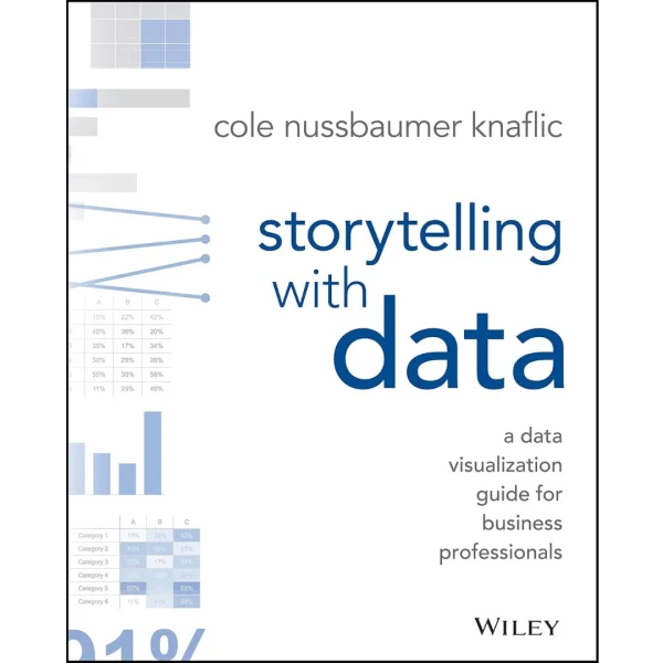
Storytelling with Data: A Data Visualization Guide for Business Professionals

(49 customer reviews)

Original price was: $37,00.Current price is: $11,99.

  • 100% Satisfaction Guaranteed!
  • Immediate Digital Delivery
  • Download Risk-Free

✔️ File: PDF 4,24 MB • Pages: 796

Don’t simply show your datatell a story with it! Storytelling with Data teaches you the fundamentals of data visualization and how to communicate effectively with data. You’ll discover the power of storytelling and the way to make data a pivotal point in your story. The lessons in this illuminative text are grounded in theory, but made accessible through numerous real-world examplesready for immediate application to your next graph or presentation.
Storytelling is not an inherent skill, especially when it comes to data visualization, and the tools at our disposal don’t make it any easier. This book demonstrates how to go beyond conventional tools to reach the root of your data, and how to use your data to create an engaging, informative, compelling story. Specifically, you’ll learn how to:

  • Understand the importance of context and audience
  • Determine the appropriate type of graph for your situation
  • Recognize and eliminate the clutter clouding your information
  • Direct your audience’s attention to the most important parts of your data
  • Think like a designer and utilize concepts of design in data visualization
  • Leverage the power of storytelling to help your message resonate with your audience

Together, the lessons in this book will help you turn your data into high impact visual stories that stick with your audience. Rid your world of ineffective graphs, one exploding 3D pie chart at a time. There is a story in your dataStorytelling with Data will give you the skills and power to tell it.

49 reviews for Storytelling with Data: A Data Visualization Guide for Business Professionals

  1. brett

    Cole takes a difficult subject and makes it understandable. By itself that would be good and worthy of praise. Clarity is always appreciated. But she does this by employing the skills, traits, and tricks that she so clearly explains. Cole implores the reader to eliminate clutter, visually demonstrates why it is important and its potential impact, then strips away at difficult concepts with clear and concise prose again and again. We readily grasp all this because of her use of context, visual display, simplicity, focus, design, and in so doing she tells a story about dealing with data and information, so that we can inform and not confuse. Perfect. But she achieves even more because through the use of these concepts she makes them useful for everyone and not only those dealing with large data sets; she demonstrates that which she illustrates. I’m a trial lawyer. I found her chapters on thinking like a designer and lessons in storytelling to be more than helpful. From the importance of aesthetics, audience, controlling narrative flow, to repetition she provides lessons in telling stories that can benefit anyone. Recommended for everyone!

  2. Evgeni Stavinov

    It’s certainly a valuable and well-written book. It provides ground rules of creating good and avoiding bad visualizations.
    However, I feel it’s somewhat opinionated, and readers should take recommendations with a grain of salt.

    In general, visualization is a highly subjective topic. There is no “one size fits all”. Here are few examples.

    Cole (the author) makes a case against pie charts. Well, theoretically I agree with the arguments of totally banning pie charts. But there must be a reason why pie charts are part of each and every visualization tools in existence. Many people find it useful, including myself.

    Completely banning 3-D visualizations because they might distort data interpretation is an appealing argument. But in many cases 3-D just looks nice and aesthetic, and doesn’t distort anything.

    Regarding color scheme design. I personally like bright colors, and so do many other people. I simply refuse drawing a heatmap using shades of blue, as recommended in the book.

  3. John Schroeder

    As a professional working in one-to-one marketing, I feel like too often we succumb to flashy “junk charts” or otherwise ineffective presentations of data. This book seeks to break this habit by teaching typical BI professionals about how to more effectively communicate using data.

    The depth at which the author discusses each of the primary topics is appropriate for the majority of applications and the visuals presented are top notch. That praise aside, if you’re looking to go (even) deeper about individual parts and pieces of charts and tables, I’ll also recommend you pick up Stephen Few’s “Show Me The Numbers,” as he gives an incredibly comprehensive view on the micro-level of visualization design. In my opinion though, this book covers enough ground for the majority of readers and is a great way to “up your game” when it comes to presenting to a variety of audiences. I’m going to recommend it to my colleagues as a way to lift the quality of data visualization in my department as a whole.

  4. David S. Saunders

    This is a well-written guide to being more effective with the presentation of data. Unlike some other books on the subject, this is not just a book on PowerPoint branded as a book on data. This is a book about making sense of data that make sense to you, and then presenting it effectively in a way that gets the point across and tells the story you want understood to your audience. the audience for this book is the person that is intimate with a particular kind of data. This person probably sees things in the numbers that a general audience doesn’t get. Simply taking that information and putting into a PowerPoint slide is not going to get results. These kind of people need help building a bridge between their data and the audience. That’s what this book is about..

  5. David Madsen

    This was a great book for me. I am a person that when I see a good graphic as part of a presentation, but had not spent much time thinking about how graphics could help communicate the message or information I was trying to connect.

    This book helped me start to appriciate the talents of others and to be a better contributor to the process.

  6. Sergey Khristoforov

    Great tips on how to present data to audience (exploratory vs explanatory). Great tips on how to build graph and not to overwhelmed it (step by step). Storytelling part covered shortly…

  7. Ramesh Natarajan

    I bought this book about two weeks and gone through each chapter. The author Cole explains the concepts of story telling with nice graphs in a neat, simple yet powerful way. She also gives out lot of other blogs and references for you to explore further if you want to get additional info.

    I liked the 3 minute story concept, the way she explained how to design a better graph with a decent and normally used types. By the end of the topic, you would be amazed how the same graph looks so appealing with the before and after graphs.

    I have gone through all of Stephen Few books and this one, along with Few’s Books, is certainly joins the list of “To be Kept Next to you at work place” books. Also, would certainly recommend going through this book often, to reinforce the concepts in actual day to day life.

  8. Breck

    This is probably the best book on creating data visualizations I’ve come across to date.

    Amazing attention to detail: not a tick mark is out of place. The author doesn’t just copy and paste visualizations from other sources (unless used to illustrate common mistakes). Instead she carefully constructs each example putting thought into every bit of ink on the page. As a result, the charts are concise and get to the point without distracting you with details that don’t add information or emphasis. This book helps you understand what’s important in data visualization and helps you highlight the important thing in all the charts you create.

    Some examples of skills this book taught me:
    – how to use muted colors combined with a few highlights to drastically improve the storytelling aspect of a chart
    – add less: unnecessary grid lines, markers, et cetera, can detract from a chart’s story

    nits: I like pie charts. I think they make intuitive sense and I even think the pie chart on page 5 would be fine if the author applied the color scheme in the bar chart below that to the pie chart. I agree that 3D pie charts are bad, but 2D pie charts are OK in my book.
    I really liked the before and after charts on pages 4 – 6. Would have loved another appendix with a dozen more of these for future fast reference.

  9. Susan

    I bought this book for my class I am taking in college.

    This is a well-written guide to being more effective with the presentation of data. Unlike some other books on the subject, this is not just a book on PowerPoint branded as a book on data. This is a book about making sense of data that make sense to you, and then presenting it effectively in a way that gets the point across and tells the story you want understood to your audience. the audience for this book is the person that is intimate with a particular kind of data. This person probably sees things in the numbers that a general audience doesn’t get. Simply taking that information and putting into a PowerPoint slide is not going to get results. These kind of people need help building a bridge between their data and the audience.

  10. Matt

    Very inspiring. I’ve been visualizing data for decades (as an engineer) and I learned quite a few techniques in this book of how to better show data in a clear and concise manner​ that conveys the message. This book is great for anyone who does presentations or reports regularly and is expected to tell a story with that data.

  11. Andrés Moreira

    The book is well written and the charts are extremely polish. The author has done a great job explaining concepts on all the different attributes that make a good story when using data.

    I recommend this book to anyone trying to improve the way they use and design charts, as well as those that need to present data to others.

  12. Gajohfo

    Recommended by a work colleague, this book does what it claims; clearly explains how and why you can create more appealing data charts. Well worth the money.

  13. Jonathan

    A good structural guidance to build an easy-to-understand and pretty chart while keep the focus to what audience care about. This is very useful for anyone who wants to present their idea or give a pitch to their audience.

  14. Steve Kline

    A very good introductory book to the world of storytelling with data and data visualization. You get some of the science behind why certain data visualizations work without feeling overwhelmed. And, you get some really good takeaways to key in on in your own work. After reading this book (and one or two others), people noticed how much my visualizations had improved.

    Cole’s blog is excellent resource as well – particularly when she takes a not-so-great chart and makes it really tell the story.

  15. Kras

    A good book on data visualization methods. Practical with some in-depth examples. Could probably be a little longer and include more chart types. Probably this will happen if there is a second edition.

  16. I Teach Typing

    I am a university professor who teaches biostatistics and I find this to be one of the best books that bridges the gap between analytics and presentation. There are some excellent books around that show visualization (e.g.,

    The Wall Street Journal Guide to Information Graphics: The Dos and Don’ts of Presenting Data, Facts, and Figures

    or books by Few

    Information Dashboard Design: Displaying Data for At-a-Glance Monitoring

    &

    Show Me the Numbers: Designing Tables and Graphs to Enlighten

    or Cairo

    The Truthful Art: Data, Charts, and Maps for Communication

    ) and there are good books on presentation (in particular I love Duarte’s books

    Resonate: Present Visual Stories that Transform Audiences

    ) but this book is unique in how well it blends the two topics. I have never seen such an excellent presentation on how to build a series of graphics. That is, with books by Few or Cairo you will know how to make *a* great graphic and with advice from Duarte, you can connect with your audience but with this book you will see how to build a series of interrelated graphics that highlight different parts of a dataset. Most of the examples are spun around business but the examples are easy to extend to any field.

    While I think the author wrote this for people who do presentations in any quantitative field for a living, this book should be required reading for graduate students preparing to defend a dissertation or thesis.

  17. FH

    Something that you would already know but being told in a very structured way. The summary section is a good recap of the entire article.

  18. K. McDowell

    This book focuses on data, with a chapter on storytelling. As a storytelling expert, I like the book, and I’ve used it in my co-taught data science storytelling course. What I do not like is that the author has copyrighted the phrase “storytelling with data,” and has her lawyer send out cease and desist notices to anyone who uses the phrase. As a storytelling expert who works with data, it is absurd to me that Knaflic, who is clearly a data expert who works with story, should “own” such a common phrase. I hope someone takes her to court and wins. I don’t have time for this fight. I still believe in the book, and I will assign it in my class for fall again, but I am deeply disappointed in the idea that this author “owns” the phrase “storytelling with data.” It is a frustrating time indeed to try to speak the language of ideas. I hope she will have a change of heart.

  19. TangoTango

    This is a really good quick-reference guide for people who need to represent discoveries and ideas from data. Not the most sophisticated study but is great for the growing population of people who need to include data as a part of their conversations.

  20. Katie

    The reviewers being critical of this book were expecting too much out of it. This book opens your eyes to some of the dumb ways we try to report out information to business leaders and does a great job of providing tips and also pushing us to think about the multiple ways we can present data. I would recommend to anyone that needs to report out certain metrics to client or the business leads in your organization!
  21. SK

    After reading this book you can that data visualization is easier than you expected 🙂
    It is book for all whose preparing reports and presentations.

  22. cori

    This was a useful reminder, but I’m not sure I learned anything new….. I’m not sure if this deserves 3 or 4 stars

  23. G. Spencer

    This doesn’t feel like a whole book of material, and some sections are stronger than others.

    In particular, the concrete examples showing evolution from default to optimized graphic are really instructive. I work in a quantitative academic field and I still learned something here about designing effective graphics to showcase an actionable point.

  24. Keeney

    All of your data work is pointless if you can’t get the message across. I spent roughly 5 years creating Business Intelligence Dashboards and this book completely changed my view and made me realize how terrible of a job I was doing.

    I was always the type that wanted to create the newest, flashiest graphs that would mesmerize people with how beautiful the graph looked. Pretty looking graphs are nice and all, but if it doesn’t get your message across, it’s pointless. This book taught me to keep the audience in mind when creating graphs. Your clients should spend less time figuring out what the graph means and more time on the overall message. Such a simple concept that a lot of us overlook with all the advancements in visual analytics.

    This book provides various examples on common visual mistakes and how to correct them. I’ve since adopted a lot of the author’s suggestions and now our company adopts them as templates!

  25. Ray Sims

    An inspiring quick read to help break free of the tyranny of Excel’s default chart styles. The book is packed with practical advice aimed at making your charts and accompanying stories more visually pleasing and impactful. There are many “before and after” examples with explanations of the “why” beyond the suggested improvements. The book provides a good foundation for the reader to then build upon with more advanced books covering (for example) interactive dashboards and the technical details of using various dedicated software data visualization tools — topics that this book doesn’t touch.

    After reading some of the negative reviews I almost didn’t purchase the book; however, I took the chance based on the quality of the author’s blog and podcast. Rereading these reviews now, the complaints regarding poor print and binding are likely from a since-resolved bootleg copy issue that the author mentioned in September 2018 a Data Stories podcast. Regarding being too basic, I can only say that I learned some valuable lessons even after several decades in the corporate world using Excel and PowerPoint and also recently completing an online course for how to use Tableau. If you are still debating purchase, do as I did and read some of the Storytelling With Data blog and then decide.

  26. R. Hurtado

    For a book for a class,I can see myself going back to use this as a reference in the workforce or as a read for someone who needs brushing up on their skills.

  27. Mariano Jorge Buscaglia Reyna

    La manera más efectiva de comunicar los logros y resultados, así como una efectiva herramienta analítica.

  28. Karan Bansal

    Professor recommended me this book for visualization course and trust me if you want to learn tableau then this is for you. Get it and learn more about representing data in much more insightful way

  29. suzanne n

    +25 year-long finance professional here and as I say to my team “this is what keeps the Robots (AI) from doing our job.” The “this” is telling a story that SHOWS company leaders and investors the key drivers of performance. This book really hammered home to me the idea that my job in FP&A is not to bombard my leadership with chart after chart of historical trends, but to distill down all the data available to me to show them MY CONCLUSIONS – what moved the needle (and you can count them on one hand). If you just want to make prettier charts, then this is definitely the book for you (stop using every color under the rainbow, if everything is bright and pretty, then nothing is important). If you want to take your career to the next level, this book will change what you report to your bosses and will make you an all-star.

  30. Sydney

    I purchased this book as required reading for a graduate study data analytics class. As with most text books, I expected it to be full of “cookie cutter” graphs and charts that had no real world application…

    I couldn’t have been more wrong! This book was not only an enjoyable read, it was also filled with insightful explanations on the thought behind WHY certain details are emphasized in graphs and how to get your point across to your audience through data visualization.

    A must read for anyone in the data science field or anyone who uses charts and graphs in a presentation format.

  31. Brant

    I straddle the line between engineering and project management, and thus often find myself making presentations to customers to explain difficult events or analyses, to request more funding for projects, or to provide courses of action for projects. All of these presentations require my colleagues and me to reduce large amounts of data down to a few key points. While we’re good with data, we’re not so fantastic sometimes at presenting it in a simple, compelling way. This book, I am certain, will fix all that.

    The book itself is a minimalist, beautiful work of art. The author walks you through 6 key topics for creating interesting, concise, and gorgeous presentations that will get your point across and compel your audience to take action. I read the book in a few days and immediately started adopting the approach in my graphs and presentations. I truly think that everyone – entire teams, really – who must make persuasive presentations should own this book.

  32. B. L. Keller

    Too many times, data presented in charts and graphs do not express specific information. The creation of these charts and graphs misses the point of creating them in the first place.

    In Storytelling with Data, the author provides insights on how to utilize graphs and charts to tell a story with your data. The book focuses on several areas to consider when developing storytelling visuals:

    – Awareness of Context — Be aware of who will be viewing the visual, what they need to know, what they already know.
    – Choose an Effective Visual — What type of visual will best deliver your point.
    – Limiting Clutter — Leaving out details that do not add something valuable and making secondary items fade into the background, so they are still available but are not the main focus.
    – Focus Audience Attention — Make the essential information of the visual stand out the most through the use of color, spatial layout, and other strategies.
    – Think Like a Designer — Keep principles of good design in mind and take the time to make your visuals appealing.

    The book goes through each of these points in detail with many before and after examples to show (not just tell) how focusing on certain design aspects can make a huge difference in getting your point across.

    I would highly recommend Storytelling with Data to anyone who creates visuals to display details of data.

  33. Daniel Morgan

    I would recommend this book to anyone who is involved with data, math, graphs, design, or who even just has to make tables and graphs casually for work or school.

    The fundamental premise of this book is that a lot of people make graphs for exploratory purposes (i.e. data vomit) when they should be focusing on explanation (i.e. story). The rest of the book focuses on ways that you can use your data to tell a narrative story. This will stick with the audience better and also be far easier to understand.

    The author has six main lessons:
    1. Understand the context.
    2. Choose an appropriate visual display.
    3. Eliminate clutter.
    4. Focus attention where you want it.
    5. Think like a designer.
    6. Tell a story.

    By following these principles and above all preparing our graphs and presentations with our audience in mind, it is possible to create far more effective displays of data.

    I have read this book twice, and I would highly recommend it.
  34. Brian520

    While other authors *cough* Stephanie Evergreen *cough* do a great job of walking you through creating unique data visualizations in Excel, Storytelling with Data provides you with a base understanding of best practices and explaining WHY they are best practices. With an understanding of what elements make a successful data visualization and case study examples of common problems, implementation is almost trivial and does not assume a certain product is always used. This is an excellent reference that I’ve read cover to cover and return to often if I encounter a data visualization problem for seeking guidance.

  35. Dwayne D

    Yes. This book provides excellent guidance, weighs considerations and shares examples of how to communicate effectively with data. From my standout, however, this book is about how to communicate to persuade, period. This is one of the most compelling and valuable “business” books I have read — because the advice shared in this book is beneficial in so many situations and contexts beyond business scenarios. I love this book.

    This book helped me to be more deliberate about what I really aim to achieve when I present — or make a request, or share something I find inspirational or compelling, or essentially whenever I need to make a point. I find the guiding principals universally applicable, such as: reducing the cognitive load of your audience, clearly specifying our recommendation of what our audience should “do” given the information we share, and taking time to crystallize the story of our message.

    Thank you, Cole Nussbaumer Knaflic!

  36. JO-E-Z

    IT was an exceptional material. I just didnt use it much . But thats the only reason i gave it 4 stars. I love the content .

  37. jimmy holder

    Pretty basic but in a good way. . This book was recommended by a coworker so I bought it. I’ve had several classes in report design, so most of this was common knowledge to both myself and my husband (physician scientist with numerous publications).

    Although we didn’t pick up a lot of new knowledge I’m giving it 5 stars because it does hit all of the topics. It’s a pretty well thought out book too. My husband will be picking up a copy to pass around to his grad students to read in their down time.

  38. Puneet S. Lamba

    I find this book very useful and have stuck with reading through it (just finished chapter 5, so I’m more than halfway through) even though the binding sucks, and the book seems to be falling apart. Although none of the pages have fallen out, it’s no fun to read a book with a broken spine.

  39. J. Edgar

    There is some good stuff in here.

    I like Knaflic’s focus on intentionality. For her, the defaults are something that should be avoided, or at least justified.

    I like how she looks at the presentation of graphic information as a story arc. There is one thing that you want to focus on to create actionable decisions. This is best, as she describes, if you are presenting. There are limitations if you have a static document that has information for multiple stakeholders.

    The book is accessibly written with a clean font and plenty of examples.

    However, I do have to push back a bit. She follows Tufte in trying to eliminate data ink. Part of the intentionality is that you have less and less information on the page and every thing you includes helps tell your story. For me though that leads to a sameness. You want your audience to not have to think so hard. You want to make sure they don’t have their eyes glaze over. But that means that everything is very simple with a muted palette. The author notes that some of these are just her preference, but the mode of thinking has become influential. Part of me wants my audience to do some work in understanding the text I put in front of them. It means a level of engagement that I worry a too-simple graph leaves out.

  40. Duncan Reid

    This book is very clear and insightful. Beautiful visuals. Picked up a lot of useful tips and practical advice that I can apply at my job/teach to others.

    I recommend picking up this along with Effective Data Storytelling by Brent Dykes.

  41. Kenny Hoang

    This book is great for starter and for even for expert in the field. I worked in the investment dept and we produce several decks a week. I saw alot of my flaws from this book and solutions to them as well!

  42. Dick Whittington

    Recommendations and examples on how to show data in unique and non-traditional ways. Also a push towards turning data into stories. As a researcher I enjoyed both. Not for everyone.

  43. Steve

    The subject matter, using visuals to tell a story, is a good area for almost all subject majors. I had this as a course text and learned quite a bite from day 1. Recommend highly. The author is obviously knowledgeable about the subject matter and enjoys the presentation of information.

  44. Griffin Ziegler

    I purchased this book for a class but actually felt it had good information. I recommend it for anyone in the business field.

  45. Mihai Ciobotea

    this is a great book for data scientists

  46. Scott Martin

    This book is a fantastic teacher for new analysts and a great book for current analysts who are trying to improve their visualizations skills. I’ve been a fan of this author and her talks for many years based around this book and can’t say enough great things. My organization purchases it for all new hires to help improve their visualization skills!

  47. Lindsay Harris

    Definitely helpful for reporting job tho I’m not sure I am so against donut charts as the author lol this seemed more geared toward presentation reporting while I do more operational type reporting. Still helpful tho.

  48. Julie Brown

    as described

  49. A. Andrade

    Very practical and straightforward guidance for data visualization. The book is fantastic . All that makes it a mandatory reference on storytelling

Add a review
X

New item(s) have been added to your cart.

Mindset Mathematic (9 books) Original price was: $275,99.Current price is: $74,99.
Quantum Computing: A Primer Course and Its Applications in Machine Learning Original price was: $1.119,99.Current price is: $74,99.
The Art of Computer Programming (6 books) Original price was: $499,99.Current price is: $54,99.
Math Illuminated: A Visual Guide to Calculus and Its Applications (4 book series) Original price was: $164,99.Current price is: $40,00.
Advanced Thinking Skills (4 book series) Original price was: $165,95.Current price is: $40,00.
The Great Mental Models (4 book series) Original price was: $135,00.Current price is: $39,95.
Learn Physics with Calculus Step-by-Step (3 book series) Original price was: $159,95.Current price is: $30,00.
The Robert C. Martin Clean Code Collection (Collection) (Robert C. Martin Series) Original price was: $66,79.Current price is: $27,95.
Python for Mathematical Foundations: Linear Algebra, Calculus, Trigonometry, and Beyond Original price was: $174,99.Current price is: $25,00.
GCSE Mathematics: Essential Foundations Original price was: $69,99.Current price is: $25,00.
Calculus of Variations: A Primer on the First Variation Original price was: $129,99.Current price is: $25,00.
Mastering Mathematical Foundations: A Comprehensive Guide with 510+ Practice Problems Original price was: $129,99.Current price is: $25,00.
Master Mental Math: Unlock Your Mental Calculation Power with Vedic Techniques Original price was: $119,99.Current price is: $25,00.
Geometric Algebra: A Comprehensive and Illuminating Guide Original price was: $129,99.Current price is: $25,00.
College Algebra: A Guided Exploration Original price was: $149,99.Current price is: $25,00.
Python Animation for Engineers: A Visual Toolkit for Data and Systems Original price was: $199,95.Current price is: $25,00.
Comprehensive Discrete Mathematics for Computer Science and Mathematics Students Original price was: $174,99.Current price is: $25,00.
Stata Tips, Fourth Edition, Volumes I and II Original price was: $79,99.Current price is: $24,95.
The Long-Form Math Textbook Series (2 books) Original price was: $92,95.Current price is: $24,91.
The Colossal Book of Mathematics: Classic Puzzles, Paradoxes, and Problems Original price was: $40,99.Current price is: $20,00.
C Programming Language Original price was: $99,00.Current price is: $20,00.
Code: The Hidden Language of Computer Hardware and Software Original price was: $64,99.Current price is: $20,00.
The Art of Game Design: A Book of Lenses, Third Edition Original price was: $112,00.Current price is: $20,00.
Graph Theory and Additive Combinatorics: Exploring Structure and Randomness Original price was: $69,99.Current price is: $19,99.
Mathematics for Machine Technology Original price was: $208,99.Current price is: $19,99.
Probability and Statistics for Economists Original price was: $70,00.Current price is: $19,99.
The Art of Electronics: The x Chapters Original price was: $69,99.Current price is: $19,99.
UPDATED Version of The Practice of Statistics Original price was: $219,99.Current price is: $19,99.
The College Panda's SAT Math: Advanced Guide and Workbook Original price was: $32,99.Current price is: $19,99.
Numerical Python: Scientific Computing and Data Science Applications with Numpy, SciPy and Matplotlib Original price was: $69,99.Current price is: $19,99.
Math Refresher for Adults: The Perfect Solution (Mastering Essential Math Skills) Original price was: $39,99.Current price is: $19,99.
Trigonometry 8th Edition Original price was: $347,99.Current price is: $19,99.
An Introduction to Statistical Learning: with Applications in R (Springer Texts in Statistics) Original price was: $99,99.Current price is: $19,99.
Elementary Geometry for College Students Original price was: $313,99.Current price is: $19,99.
Math for Electricity & Electronics Original price was: $117,19.Current price is: $19,99.
Math with Bad Drawings: Illuminating the Ideas That Shape Our Reality Original price was: $30,00.Current price is: $19,99.
Calculus: Early Transcendentals 3rd Edition Original price was: $313,99.Current price is: $19,99.
Pre-calculus, Calculus, and Beyond Original price was: $50,00.Current price is: $19,99.
Trigonometry 11th Edition Original price was: $289,95.Current price is: $19,99.
Mathematics: A Discrete Introduction Original price was: $375,99.Current price is: $19,99.
Calculus 12th Edition Original price was: $289,99.Current price is: $19,99.
Introduction to Linear Algebra (Gilbert Strang, 5) 6th Edition Original price was: $87,95.Current price is: $19,99.
All of Statistics: A Concise Course in Statistical Inference (Springer Texts in Statistics) Original price was: $47,99.Current price is: $19,99.
Large Language Models: A Deep Dive: Bridging Theory and Practice Original price was: $84,99.Current price is: $19,99.